Keywords
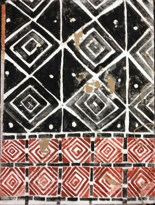
Turkey
Monoprinting
How to Cite
Abstract
When I was little, one of the best presents I received was a box of coloured crayons; to my young self, those crayons were magical. What I remember most vividly was the colour magenta. Hair, clothes, and flowers all could be magenta in my imaginary world. Although I hardly use magenta these days, the allure of colour, in general, has informed my work throughout my practice. I use colour in my printmaking and painting to create a mood, evoke a memory, or delight the viewer’s eye. The emotional impact of colour is undeniable. Colour and place are seductive; the landscape and environment in each case inform the colour palette. For example, the prints made in Firenze are characterised by sombre ochre tones and illuminated with gold. Prints made on the California coast, with their vibrant blues and muted greens, evoke a smell of the sea. The prints made in California respond to wildfires, using red/orange that are hot--hot as the actual flames.
References
Hodder and Tsoraki, ed. (2021) Communities at work: The making of Çatalhöyük. Available from academia.edu (Accessed 25 March 2024)
Lingle, Veropoulidou et al. (2021) The colour of things. Pigments and coulurs in Neolithic Çatalhöyük. Available from academia.edu (Accessed 25 March 2024)
Mellaart, James. Catal Huyuk, A Neolithic Town in Anatolia. (1976) NY: McGraw Hill Book Company.
Schotsmans, Ebony Bennison-Chapman et al. (2020) Pigment Use at Neolithic Çatalhöyük Near Eastern Archaeology. Available from adademia.edu (Accessed 27 March 2024)

This work is licensed under a Creative Commons Attribution 4.0 International License.
Copyright (c) 2025 Adrienne Momi